By
Soon one will be able to differentiate the Nexus condominium towers from surrounding high-rise towers due to its unique twisting forms, generating an “X” as the floorplates travel up the building. While the architecture is certainly fascinating, the rotation of floorplates provide unique views and experiences for each condo owner. These grand views are only one of the many features driving buyers to rush to reserve their condo unit. Equally important are the one-of-a-kind interiors which reflect the building’s design language. Let me share a few secrets Weber Thompson incorporated into these floorplans to better utilize space and ultimately reinforce these breathtaking views.
Break away from the swing door: Locating pocket & barn doors strategically makes a unit feel larger and frees up space within bathrooms or elsewhere where swing doors might prevent easy access to plumbing fixtures or the like. The “Nexus bathroom” in many one bedroom units features a pocket door on either side of the room, making the standard three fixture bathroom feel grander. It allows the vanity to shine on its own, with the water closet and tub/shower on the wall opposite. Not only does this bathroom eliminate the need for a separate powder room in the unit, but the doors provide easy access, almost functioning as a hallway itself.
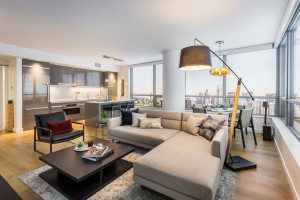
No more long, winding hallways: Nexus floorplans integrate these space-saving pocket and barn doors where it matters. In addition to bathrooms, many of the bedrooms incorporate a barn door or pocket door (per floor plan type) located off the living space, omitting wasted hallway space to access the bedroom. Instead, the extra square footage furnishes more pertinent spaces, like the living and dining rooms. While one might question the non-traditional access to a bedroom off the end of a living space, what this does is open up the expanse of exterior glazing whereas conventional separation of spaces limits the span of glazing to each space. As a result, the unit provides drop dead views and ample natural light within.
Utilizing wasted space presented by columns in a high-rise: Units were carefully designed so demising walls hug columns whenever possible. However, when columns protrude into bedrooms, instead of furring out the entire wall, wall ledges provide a backdrop for a headboard, niches for art or personalized according to the whims of the owner.
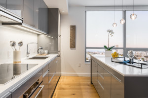
Streamlined, integrated kitchens: The kitchen’s clean lines & concealed features make it blend smoothly into the architecture. Nexus’s typical linear kitchen offers symmetry in design, with integrated casework panel appliances on both sides, including a custom European style appliance garage (or an integrated wall oven & microwave in trim-kit in penthouse units). Also contributing to this kitchen’s clean appearance is a thin profile slide out range hood, complete with lighting. Below this is a low-profile induction cooktop. Instead of decorative cabinet pull hardware, this kitchen has linear pulls which blend in seamlessly with the kitchens’ aesthetics. The kitchen’s sink cabinet is comprised of drawers, which offers more thoughtful, concealed storage than the average sink door cabinet.
Built-in casework: In addition to the kitchen and vanity casework, some of the units feature casework closets instead of the traditional walled in closet with bypass doors. Not only is this visually more appealing, but it eliminates the depth of a framed-in wall to house bypass doors. One example of this is seen in the built-in unit entry casework which not only serves as an entry closet, but it also houses the washer/dryer (so no actual laundry room in smaller units). That’s space that goes back to rooms that matter; critical for units of less square footage.
These efficient floorplans demonstrate how to maximize these spaces to enhance the units’ spectacular views. Any condominium building might feature great views, but if the layout and design is not reinforced to showcase these views, they cannot be enjoyed to their full potential. The perception of space in a well-designed unit outweighs actual square footage, especially when living in the heart of the city where every square foot counts. This is big city living.
To see how furniture affects the perception of space, the WT Interior Design Team’s recent appearance on KOMO 4 News’ Seattle Refined, featuring Weber Thompson & Alchemy: Click here to watch


