Terry Thomas Experiential Design
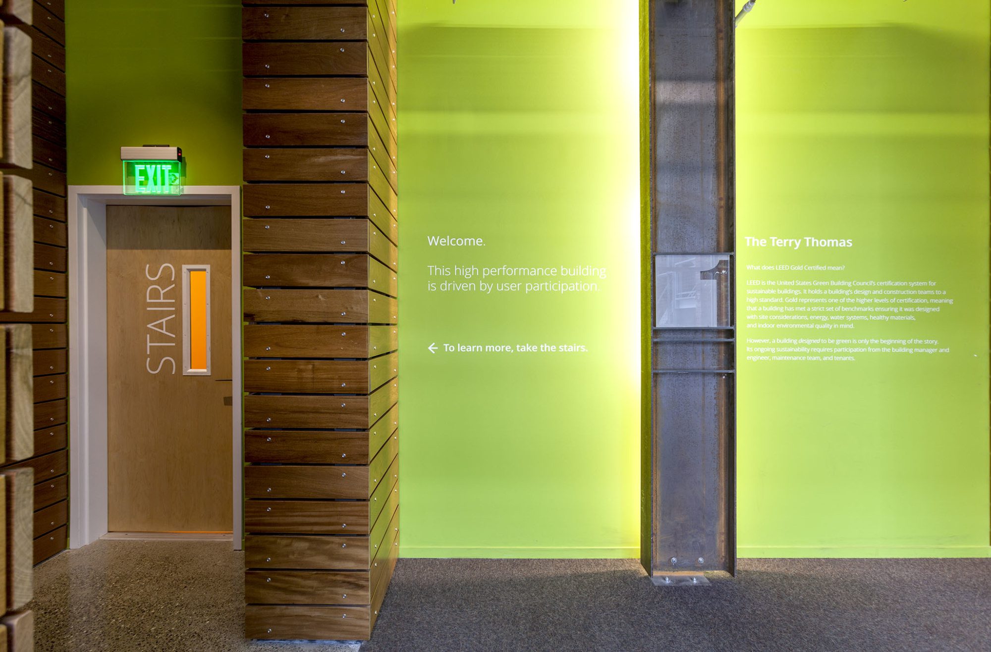
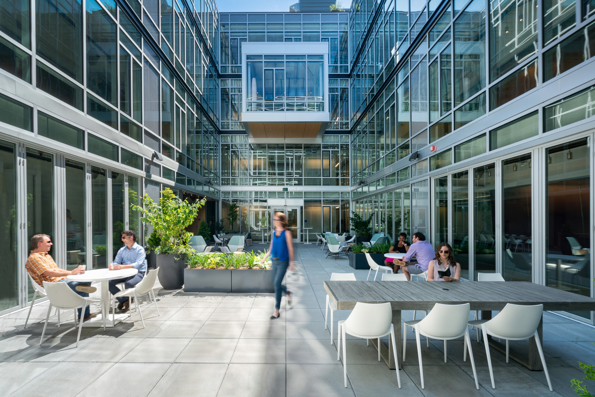
Weber Thompson’s Experiential Design Studio designed environmental graphics and wayfinding signage for the award-winning Terry Thomas building in Seattle’s South Lake Union.
Client Name
Steven C. Grey & Associates
Location
Seattle, WA
COMPLETION DATE
2014, 2019
Program Overview
Wall graphics and wayfinding signage for 40,000 GSF LEED Gold Certified office building
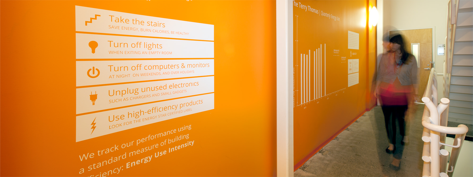
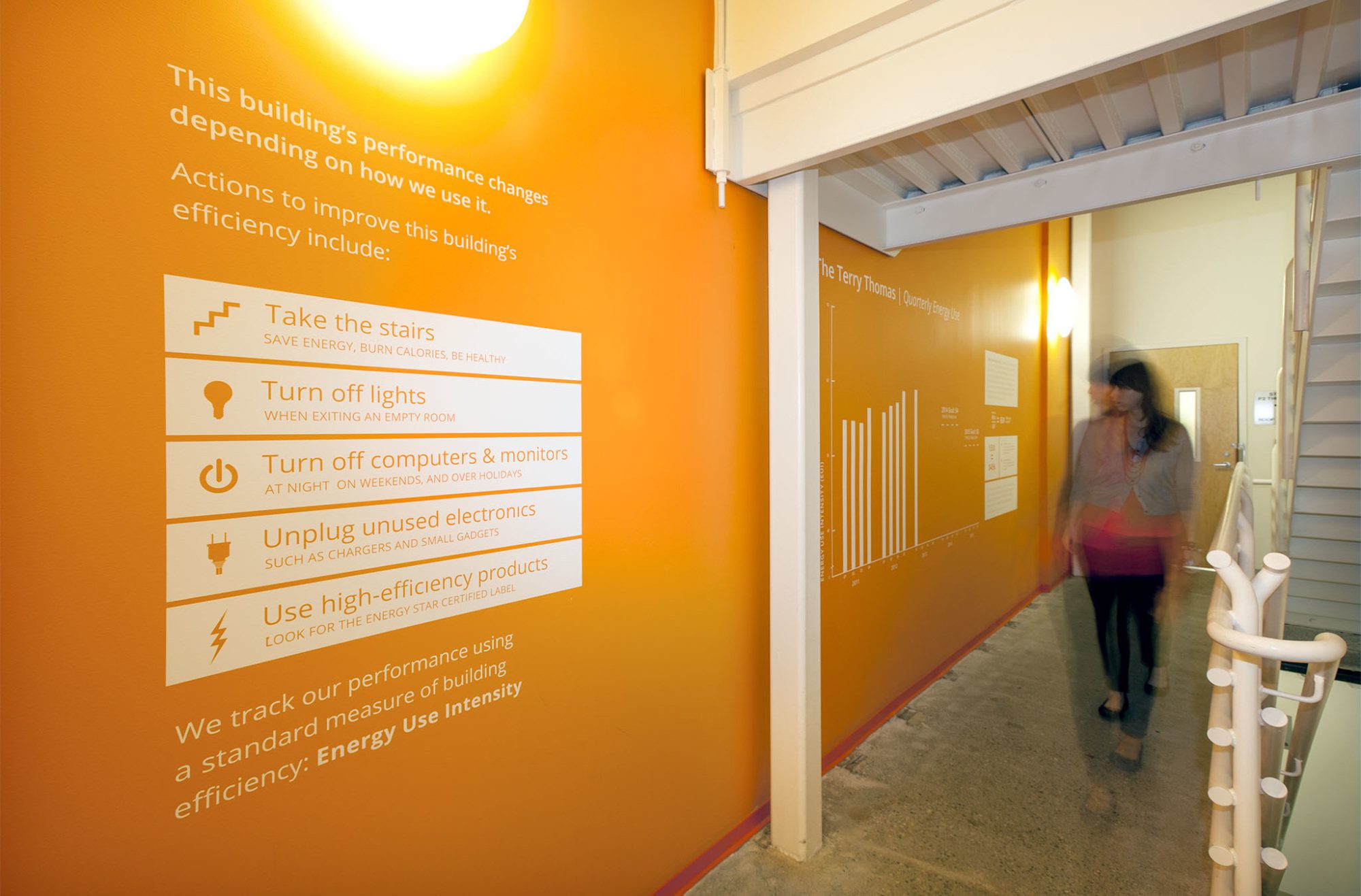
Engages tenants through signage and ongoing data visualization to encourage behavioral shifts
PHOTOGRAPHY: WEBER THOMPSON
Occupant education
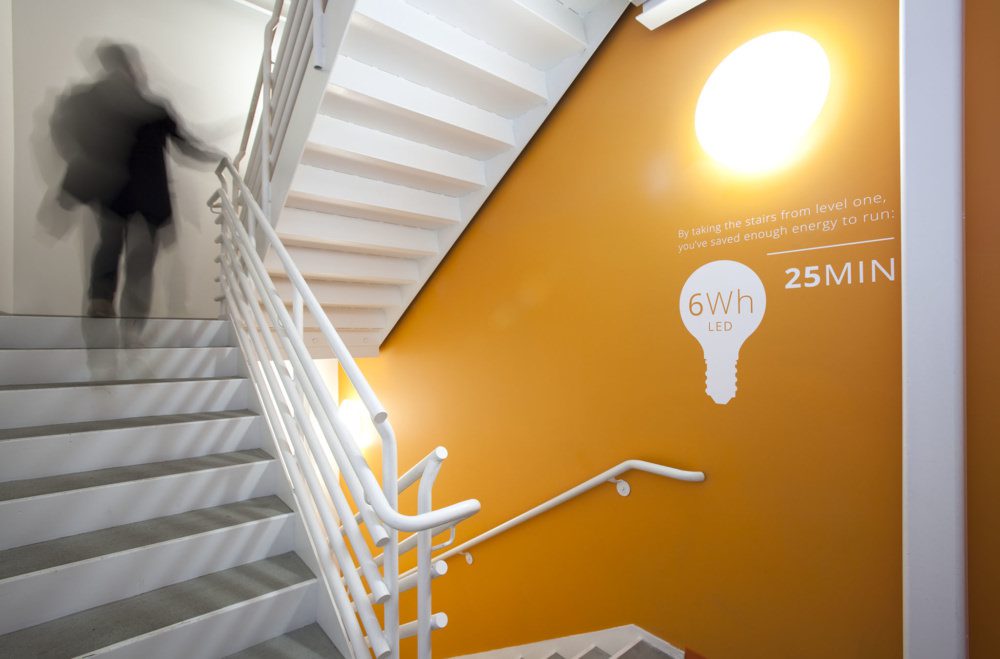
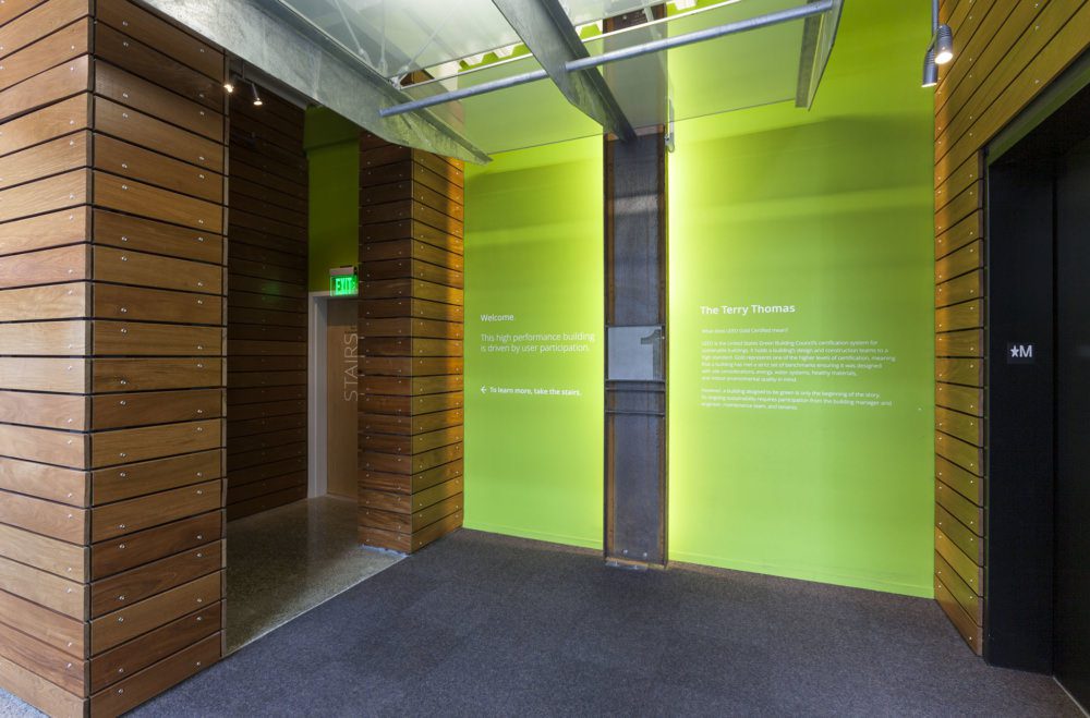
One of the core principles of The Terry Thomas building is reduced energy use. In 2013, Weber Thompson’s Experiential Design Studio was tapped to help create a set of applied graphics to educate building occupants about the importance of energy-reducing behaviors. The goal was to lower the building’s already low energy use, which is about 50% less than a comparable building.
Tracking & ongoing improvement
Weber Thompson’s Experiential Design Studio worked hand in hand with the building management company, Stephen C. Grey and Associates, to not only create the graphics, but track energy use and engage the tenants of the building. The thesis being that sustainable design is key in energy efficiency, but ongoing improvement can only occur when all tenants are engaged in the energy conservation goals of the building.
Enticing cyclists
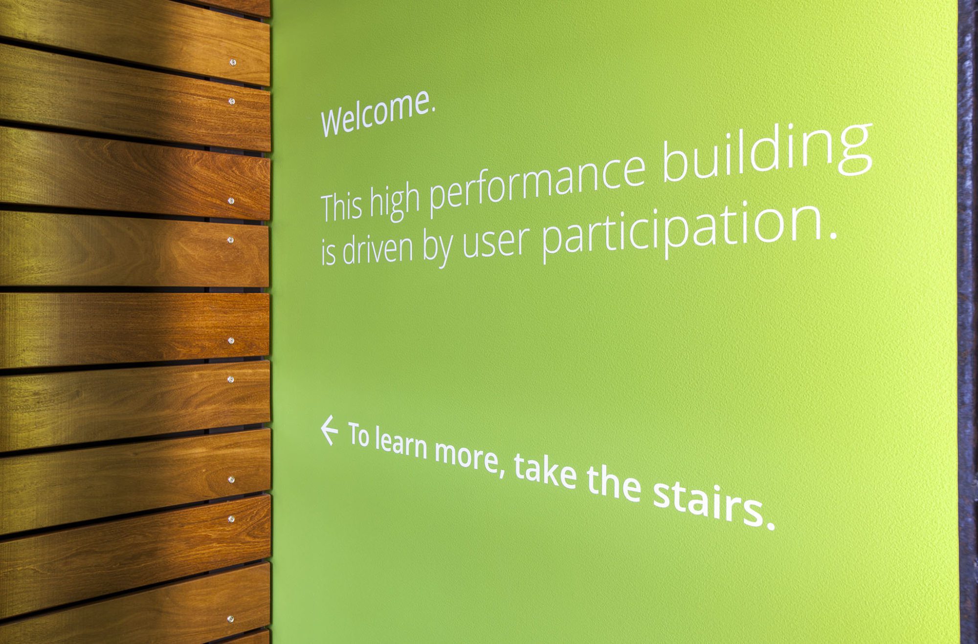
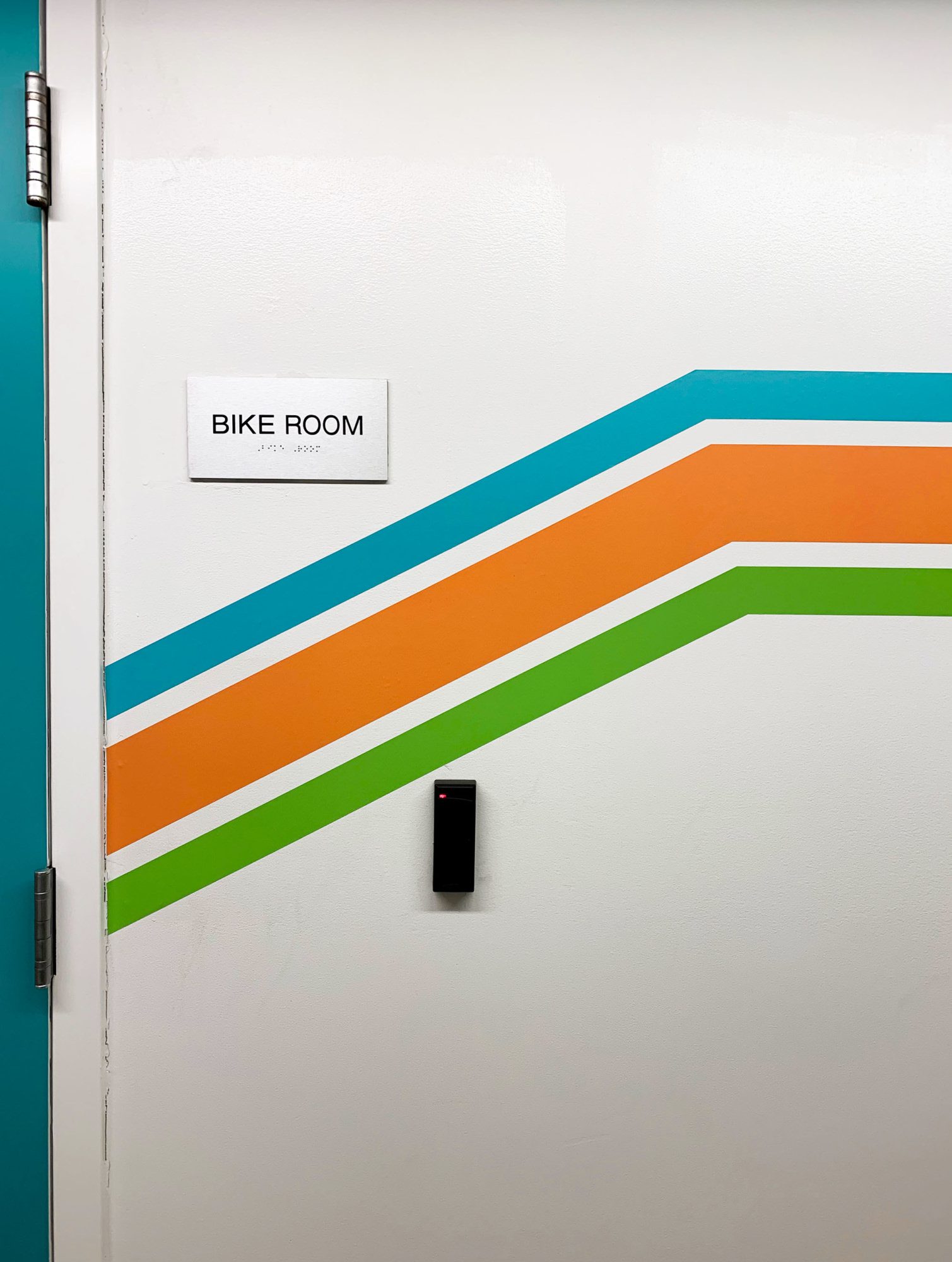
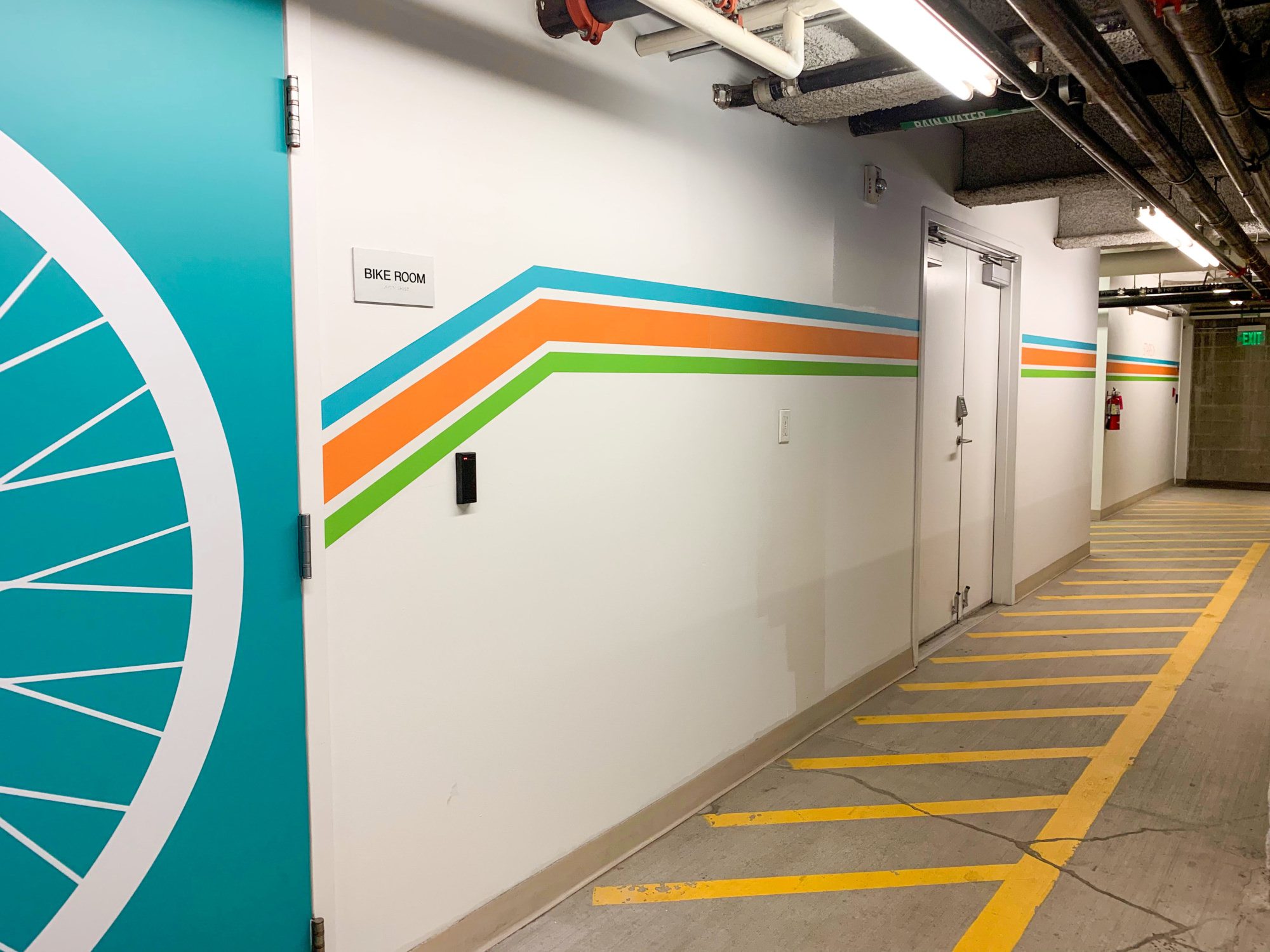
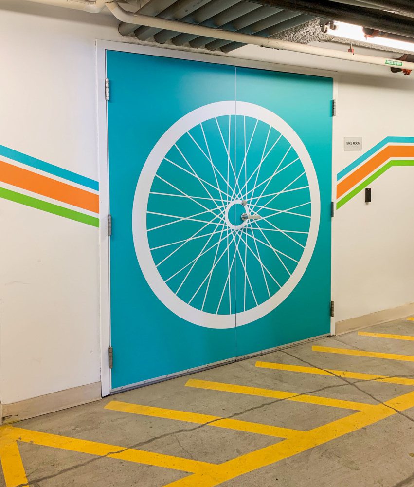
This new set of environmental graphics and wayfinding signage for the building encourages use of the internal stairs rather than the elevator. The stairwell includes data about overall building energy use, provides space for tracking data in the future, defines key terms and metrics for building energy use, and gives stair users insight about how their efforts are making a difference in the building’s energy use. In a later phase, additional graphics were applied to the exterior of a bike room added to the building’s parking level. This vibrant patterning made the bike room easier to find and more fun to use.
Terry Thomas Experiential Design in the News
Seattle office building engages tenants to reduce energy use
Development Magazine | NAIOP
Summer, 2014
Terry Thomas encourages tenants to cut energy use
Daily Journal of Commerce
March, 2014
