By Erik Schultz
Erik is an Associate at Weber Thompson. His strengths include taking the diverse challenges that architecture can present and synthesizing them into a cohesive, beautiful and functional design.
I recently had the privilege of being invited by the Asian American Designers Union (AADU) to be a panelist during their “Ace Your Next Interview” virtual workshop. The goal of the event was for experienced professionals to review students’ and young professionals’ design portfolios and offer advice for how to improve both their portfolios and interview skills. The participants produced outstanding, thoughtful work and I enjoyed working with them to ensure their work is presented in an effective manner. Below I’ve outlined my favorite tips for creating a successful portfolio:

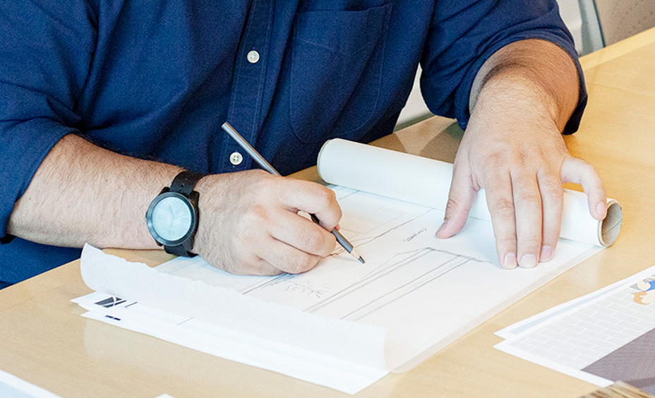
Highlight your process. Sketches, concept imagery, photos of process models, and diagrams will all help clarify how you think and approach design problems.
1. Highlight your process
Presentation plans, technical drawings, and beautiful renderings all work to successfully describe your project, but they don’t fully showcase the most unique and important aspect of you as a designer: your process. Be sure to include plenty of graphics that walk the viewer through your design process and illustrate how you think. Sketches, concept imagery, photos of process models, and diagrams will all help clarify how you think and approach design problems. While technical abilities are very important and sought after, what is ultimately going to help you stand out – especially for someone with little to no work experience – is a strong design process.
2. Don’t overwhelm with information
Highlighting your design process in your portfolio is important; but don’t overwhelm your reader with information. Provide some background on your project and research, but keep it concise. Pages of text should be avoided. If you must have more than a short paragraph on a page, establish a visual hierarchy with your text so readers’ eyes are drawn to the important pieces of information first. Less critical descriptions should appear secondary; then review and ask yourself again if that information is necessary. Pay attention to your graphics as well; too many graphics squeezed onto a page can be visually overwhelming and will detract from the clarity of your message. Try to find the right balance of text, graphics, and spacing on your pages to convey a clear, concise message.
3. Scale matters
Often in design school students present their projects on large boards which feature sizable graphics with proportional text. Professional portfolios however are generally viewed on a computer screen, or even a phone. They need to be composed for a much smaller scale, and need to look professional both on the screen for initial applications and in print for interviews. It is very important that you view your graphics at the scale at which they will be printed. Quite often you will find that at a smaller scale, text and other fine details in your graphics become illegible. Hiring Managers have very little time, and if they can’t read your portfolio, they will move on. This means that you need to ensure your graphics are legible at your portfolio’s scale.
4. Clarity is important
Stylization can be a great way to communicate feeling through a 2D graphic and showcase your unique style. Done effectively, adding bold colors, shapes and texture can take a typical drawing and make it outstanding. Be very careful, though, that your stylization of drawings serves a purpose and does not take away their clarity. Communicating your design to others is the primary purpose of drawings, so be sure that your graphics are clear and not leaving people confused.
5. Plan what you’re going to talk about and show it!
Verbal communication is a critical skill. But simply talking about your design can only go so far, especially since potential employers will likely look at your portfolio for the first time before meeting you for an interview. It’s important for your portfolio to graphically communicate the most important aspects of your designs. Think hard about how you want to explain your project during an interview. What features of your design do you want to explain? What do you want to highlight? Then make sure that you have graphically communicated those features in your portfolio. Enlarged floor plans, diagrams, sections, perspectives, etc. will all help to better illustrate the important aspects of your design. Be sure that there aren’t any important aspects of your design that can only be explained verbally. Interviewers often show a portfolio to others in their firm who were not in the interview. You need a great portfolio that successfully communicates your designs without further explanation.
6. Don’t be afraid to include non-architecture work
While the bulk of your portfolio should be about your architectural design, if you have any other skills or hobbies that show your creativity include it! Photography, painting and drawing, furniture making, etc, can all help show off your creativity in a meaningful way.
