Sustainable design is not only the wiz-bang high-tech features of a green building. Simple solutions contribute to a sustainable design, too.
One such approach Weber Thompson used is to minimize the use of material. In our new office, wherever possible we designed our systems, materials and finishes so they could perform more than one function. In this way one product performs a double duty.
Here are some examples to consider:
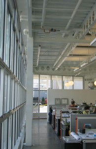
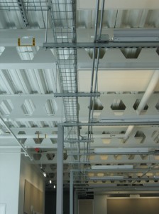
> The castellated beam floor framing system of our new building is left exposed and painted white. Not only does this tell the story of how the building works, the white paint enhances the light reflection for both daylight harvesting and indirect lighting of open office areas. The design of the beams also serves as a design aesthetic, informing other choices we made in the build-out of our office space.
> The structural slab is designed to be a floor diaphragm; this structural component resists wind and earthquake shear forces. This same slab is lightly ground and treated with a concrete densifier. The densifier is not a coating that will wear off, but an organic compound that penetrates the concrete and hardens the open cells. There is no finish to maintain, just vacuum or damp mop as needed. This exposed concrete slab is used as the finished floor in the circulation areas, like streets in a city, marking the paths of common travel.
> Ceiling-mounted panels are both light reflectors and sound absorbers throughout our open studio areas. Made from a product called Ecophon, these 4 foot by 6 foot panels are framed in white aluminum and add to the aesthetic pattern of the ceiling in these areas.
> Carpet tiles in the open office areas mark these zones as more private. The carpet under foot (or chair) provides more comfort at our desks and adds further sound attenuation to these areas of the office.
> Overhead in the studios we use a product called B-Line. This erector-set-like strut system provides suspension for the electrical conduit that distributes power in the offices, and the cable tray that carries all of the data cables necessary in a modern office. This same system is extended to support off-the-shelf industrial strip lights that are used for up-lighting in the open studios. This product is normally use in an industrial environment or hidden behind a suspended ceiling. In our offices we use it to create a phenomenal ceiling plane and celebrate the technology of the modern office.
We take the same approach to design in our conference rooms:
> A product called Prago, usually seen as wall panel in auditoriums, is turned into a perforated wood ceiling. In our four main conference rooms these surfaces are used both as light reflectors for indirect fluorescent light fixtures, and sound absorbers.
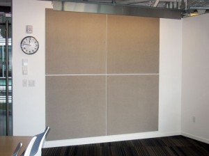
> These rooms also feature a grid of Homosote panels on the walls. Homosote is a product made from recycled newspapers. These panels are used as tack surfaces (for drawing display), and sound absorbers.
> Just as in our open studio spaces, the carpet tiles in conference rooms provide a softer surface under foot. The carpeted area marks and describes the area of the offices dedicated to meetings with our colleagues and clients. The same material also adds more sound attenuation.


