By Maggie Carson
Maggie sees the built environment as an opportunity to enhance people’s lives. As Weber Thompson’s design lead for Orenda, that perspective guided her engagement with stakeholders. She has over 15 years of experience creating spaces that range from retail and large international mixed-use projects to affordable and market rate residential. She has a passion for complex projects and loves working with clients to bring each unique vision to life.
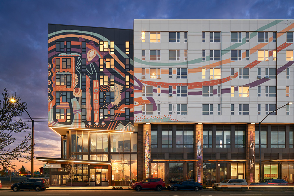
Orenda at Othello Square // Photography by Moris Moreno
Most people’s reaction to seeing Orenda for the first time is “whoa.” It’s not your typical building. It’s bold and colorful, grabs your attention and takes you a little by surprise. In many ways, that was the point.
Orenda looks different because it was born out of something different.
Positioned half a block from Seattle’s Othello light rail station, Orenda provides affordable and work-force housing atop the new Odessa Brown Children’s Clinic (OBCC), dentist clinic, and Tiny Tots early learning center. While the synergy between uses is special, the collaboration that transpired is the real secret to Orenda’s magic.
Long before there was a developer, an architect, or even a specific group of building partners, there were residents in the Othello neighborhood who wanted to halt the displacement they were witnessing. They wanted a development that would support longtime residents staying in their vibrant community, as well as a project that would embody and nourish their unique neighborhood. This group of residents worked together for many years to craft a redevelopment vision for the whole city block. They involved anyone in the neighborhood willing to participate and worked to establish design principles and objectives for redevelopment. After years of thoughtful conversation and collaboration they reached out to developers and architects to bring their vision into three dimensions.
The Othello stakeholders made it clear the Othello Square redevelopment would not be like others. It wasn’t enough for the building to just look “different”. The buildings’ designs needed to connect with the neighborhood. They needed to be authentic in how it would be differentiated.
The Orenda design team, Weber Thompson’s architects, landscape architects and interior designers, dove into research and engagement to better understand Othello residents, building partners, and future patrons. We learned Othello is one of the most diverse zip codes in the United States, with 144 different languages represented. The landscape designers researched the impacts of pollen on people who suffer from asthma due to poor urban air quality. As part of understanding the work of OBCC, we learned about Adverse Childhood Experiences; a term used in the study of the impacts traumatizing events have on children. We looked at countless typologies of patterns and forms from around the globe to create references that could resonate with immigrants in the neighborhood.
Our studies started to weave into the details of the design. Textures and patterns from throughout the world can be found in everything from the exterior masonry pattern to the interior tile, fabrics, and colors. The landscape plant palette boasts a select group of plants with low pollen ratings and heritage from other parts of the world. All the plants are non-invasive and adaptive to Seattle’s climate but could also be recognizable to someone who grew up in parts of Africa, Asia, or elsewhere.
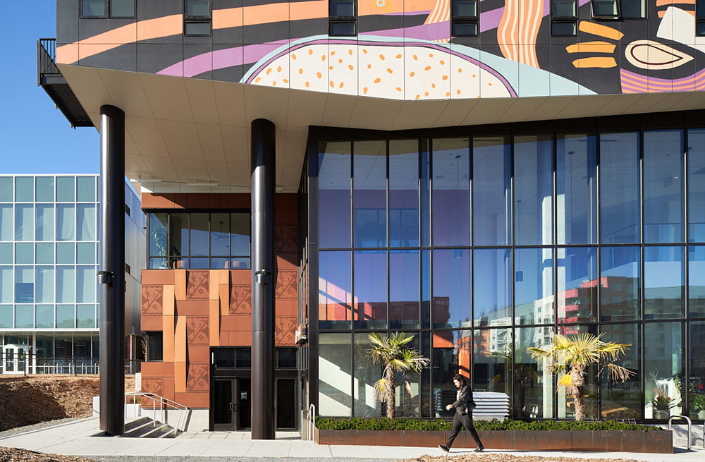
The tall, glassy entry foyer at Orenda // Photography by Moris Moreno
Inspired by the collaborative atmosphere established by the Othello residents, the design teams for Orenda wove that collective spirit into the building design by channeling all users through a communal tall, glassy entry foyer.
We knew the entry massing needed to be eye-catching and expressive. Early on we created sketches that captured the idea well but lacked specific detail for execution. Using these sketches as guidance, we set forth trying to define exactly how we would create the desired impact and we kept coming back to the idea of authenticity. We felt the challenge of honoring the diverse neighborhood and the deep desire for the community be recognized. It was at this point in the design process that the building stopped being just a building, and instead became canvas for community-lead artwork that exhibits Othello.
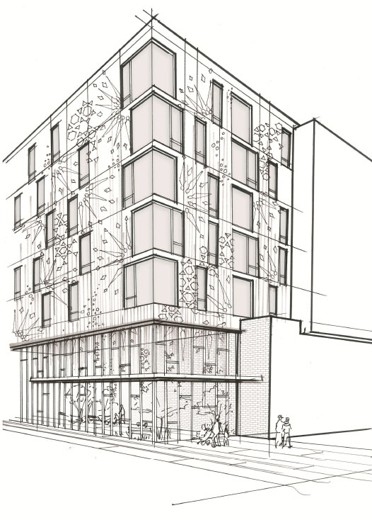
Initial sketch concept of Orenda’s mural.
Instead of an “architectural feature” defining the entry, we have a mural illustrating personal stories and inviting people to enter the building. The large painting wrapping the building above the entry expresses the community’s joy and vibrancy and calls people towards it. On the streetscape, instead of having pilasters between sections of storefront, we have art pillars reflecting history and culture in the community. These pillars both literally and figuratively ground the building to its foundation and act as the support for residents above.
There was freedom in letting go of the exact expression. Stepping back from control allowed for the real visionaries of Othello to express themselves and it provided opportunities for others to engage in the design.
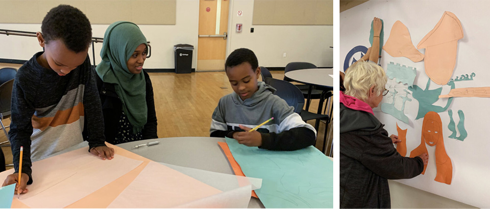
Artist Emily Eisenhart held workshops with residents in the neighborhood to help conceptualize the mural artwork // Photos courtesy of Emily Eisenhart
One key person who joined the design effort was the muralist Emily Eisenhart. A Seattle native herself, Eisenhart has a background in both commercial art and cultural anthropology. To design the vibrant mural wrapping above the entry foyer, Eisenhart held workshops with residents in the neighborhood. She led them through exercises in which they each told a story about their life with shapes and forms they cut from colored paper. Each neighbor crafted their own story and shared it with the larger group. Eisenhart composed the final mural on Orenda using the cuttings and stories from the people who came to the workshop. To this day, neighbors can point to parts of the final mural as pieces they recognize and have meaning for them personally.
On the streetscape, instead of having pilasters between sections of storefront, there are art pillars reflecting history and culture in the community. Leadership at the OBCC worked with art coordinators to select local artists of Black, Latinx or Indigenous heritage to create the artwork for the three dimensional banners. The subject matter of the banners ranges from personal reflections on heritage to cultural representation, beauty, health and wellness.
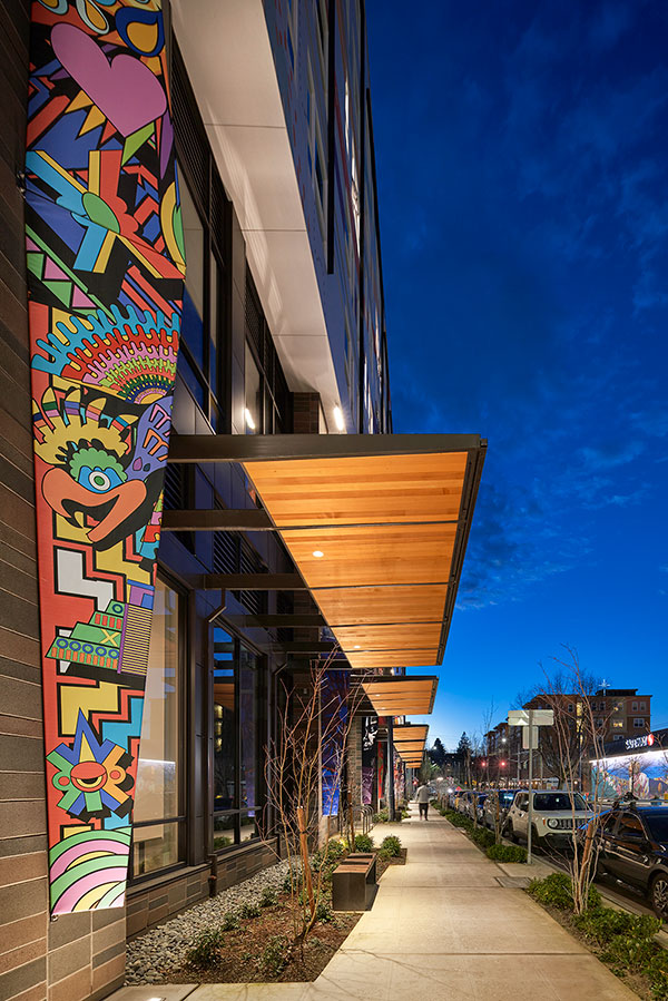
Art pillars on Orenda reflect the history and culture in the community // Photography by Moris Moreno
Most importantly though, the impact of the building isn’t created by just one feature, or by just one organization, or just one voice. Led by the architects and designers at Weber Thompson, there were many contributors without whom this building would not be the same, including neighborhood residents, local artists, the Othello Square workgroup, Odessa Brown Children’s Clinic and their T.I. architect NBBJ, Spectrum Development Solutions, Tiny Tots Early Learning Center, and Absher Construction.
Just like the many people, forces, cultures, and organizations who came together to craft Orenda, the many elements of art and architecture come together to create a richer, more vivid building that feels alive. The layers of expression and local perspective give the building a soul unlike any other. It is unique and authentic. Each piece of art or each detail can be enjoyed by itself, but the holistic expression of all the pieces together creates the moment of “whoa”.
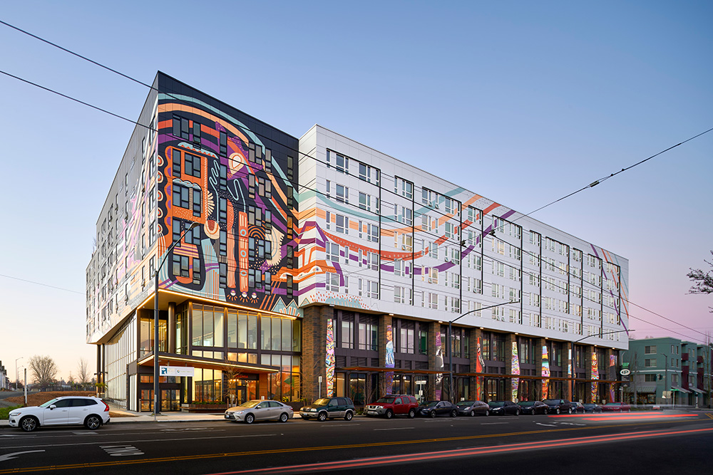
Art and architecture come together at Orenda to create a richer, more vivid building that feels alive // Photography by Moris Moreno
